Stormcairn -
A world of warcraft zone
A small landing on Stormcairn island. A stopping point between Lordaeron and Northrend.
regularly assaulted by the habitants of dragon isles, the alliance is once again taking up the monumental task of holding this land.
Role
World Design - Project Lead
Team Size
1
Tools used
Noggit Red - WoW WOTLK
Overview:
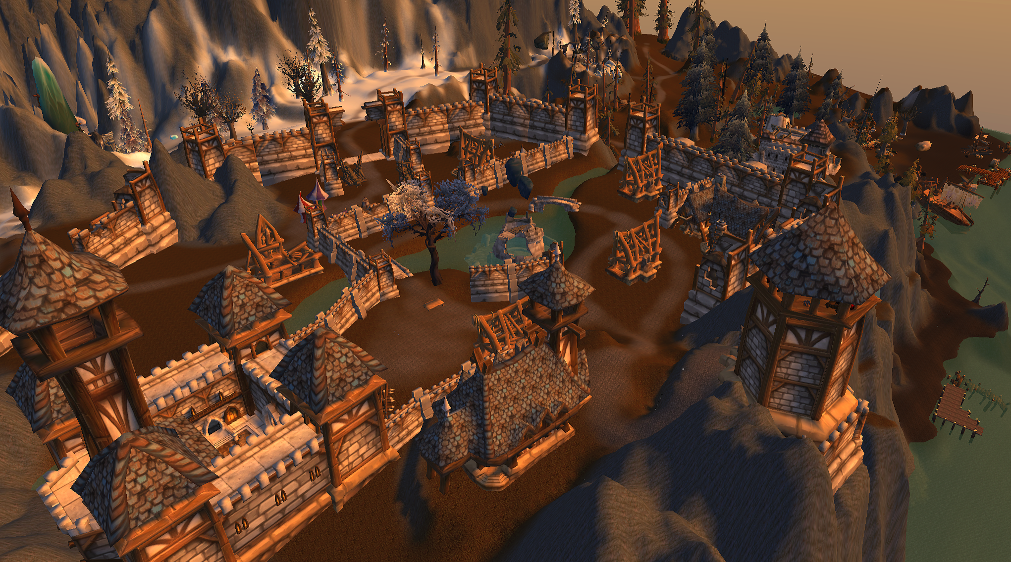
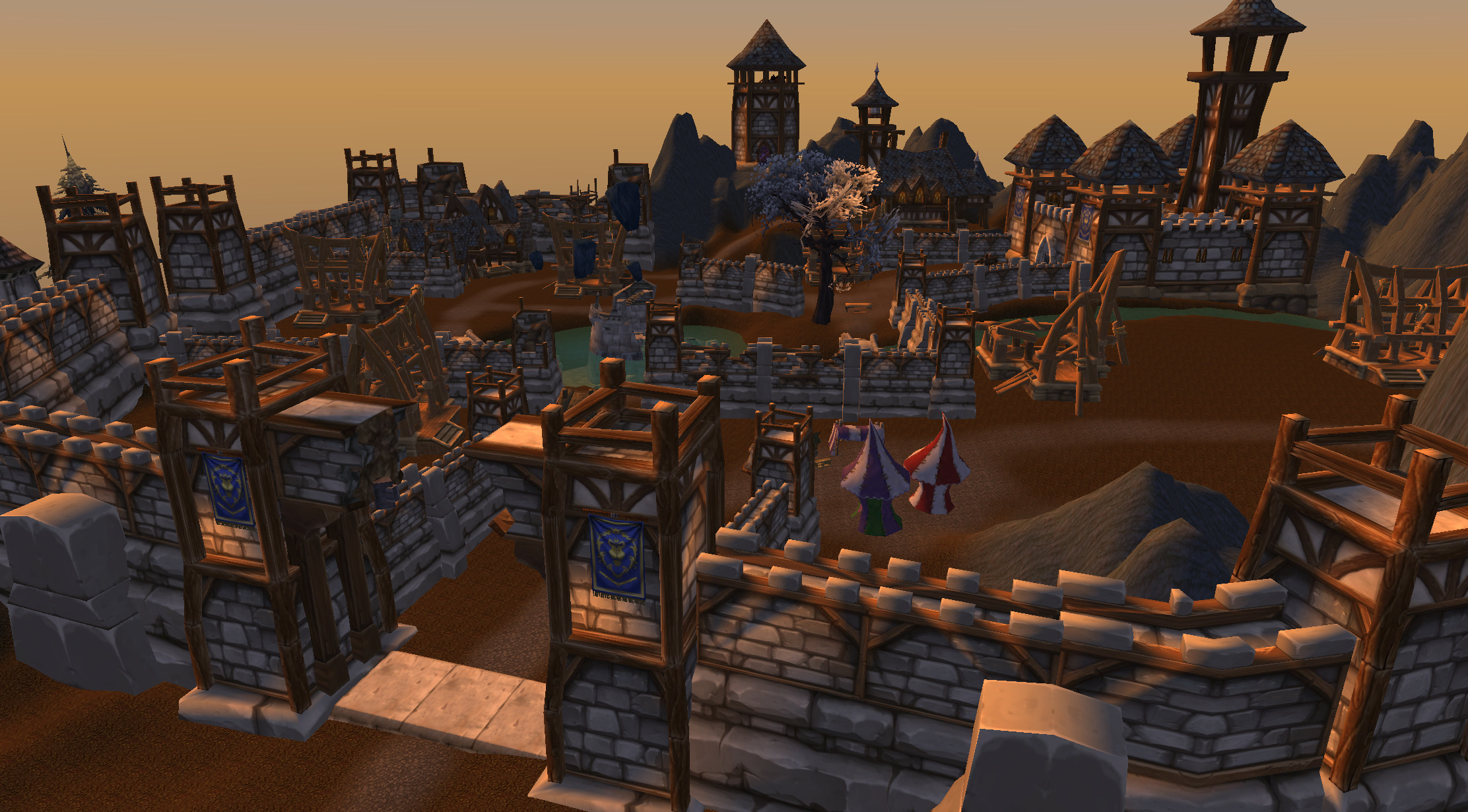
Stormcairn is a 4 tile location inspired by northrend’s howling fjord & storm peaks. I wanted to implement the verticality and flat plains that both areas do so well. I broke the map up into 4 major pois:
Stormcairn Castle
the breaks beach
the excavation site
gemagnome
The goal was to create a location that could realistically be a low-level (20-25) zone in a northrend style. I focused primarily on pacing via walking speeds and pass throughs on mounts. I also wanted it to be a hub for those who started here.
This is my first map made with World of Warcraft assets & tools.


Design goals:
Stormcairn was designed to be a believable World of warcraft questing zone that could serve as a “stepping stone” between lordaeron and northrend. my primary goal was to capture the atmosphere and scale of northrend while still making a space suitable for low-level players. I wanted to get that dramatic cliff feeling of howling fjord with the open and forest dense landscapes of storm peaks.
Beyond just the visual inspiration, the zone should support natural exploration. Players are dropped in at the breaks beach at the lowest point of stormcairn which naturally will cause them to climb upwards to the castle while questing. I really wanted to employ visual ques to keep their eyes off of the map and quest map markers.

World layout & Pacing:
The layout of Stormcairn is built around low-level player movement and travel time. I designed the island to function both on foot, and while mounted. I wanted to ensure the routes between major locations felt meaningful to a walking player speed without becoming tedious. Each path was shaped to go into a different environment and still reveal the other options available from a distance. This encourages players to move more naturally towards points of interest.
How I kept story and layout balanced:
At some point in content design, you have to balance the worlds shape with the vision you have for the enhabitants and creatures.
keeping this in mind for connecting the four major areas while maintaining a feeling of a larger frontier settlement rebuilding a dangerous island fortress was a bit difficult. I found that the best way for me was simply remembering that I wanted the player to rise up throughout this zone.
IT came very naturally once the scale and map heights were finalized. :)


Overall, the world built itself around the vision that I had. Changing as I saw it shape out. Building in an engine for the first time can be tricky but also provides new creative avenues.
Points of Interest:
The island is divided into four primary points of interest that each serve a distinct narrative purpose to teach whats happening on stormcairn.
The breaks beach serves as the island’s landing area and first impression. Highlighting the constant struggle to maintain a foothold on the island.
The excavation site introduces the history of the dragons before the dragon isles were introduced. This helps to tie the location and future content together. Adding a sense of discovery and a deeper history to the landscape.
Gemagnome is a more unique way to keep the lorderan feel. It is a small gnomish science tent that is studying the strange crystal and natural landscape surrounding it nearby Stormcairn castle.
Stormcairn castle is the central alliance stronghold and player hub. Instanced out and destroyed to begin, as you complete quests in the zone it will begin to come alive. Eventually leading to a new hub for players to hang out and an anchor point for exploration further into stormcairn island.


Questing:
stormcairn was designed to support about 15-20 quests centered around retaking the alliance foothold, investigating the excavation site, and pushing back an assault from the dragon isles. Each poi was planned with quests, travel effiency, and encounter placement in mind.
The players journey begins at The Breaks Beach, where arriving adventures establish themselves within the alliance foothold and are introduced to the island’s ongoing conflict. This location serves as a natural onboarding area, offering a few introductory quests, enemy encounters with the native vrykul, and narrative setup to guide you towards the castle.
The excavation site is the first stop in questing and between breaks beach and there, you will find a few gather, repair, and fetch quests between the beach outpost’s leader grant and the excavation sites researcher orthnor. Orthnor is trying to determine when the last dragons were seen in stormcairn and has found a skeleton.
Once research has concluded and the outpost is ready to move in, you will fight through the Vrykul holding the ravines bridge in a scripted follow quest moving supplies to the castle.
Once your team has taken the abandoned castle you will begin quests to rebuild the inn, watch tower, gate, and bastion. This will be broken up by other quests at the excavation site & rumors of what is occuring at gemagnome tents…
Story arc:
This is not a full quest document, just a small chain of the quests flow.
Chapter 1: A Fragile Foothold
Arrive at the breaks beach
help secure supplies
defeat raiders attacking the shoreline
Chapter 2: Trouble beneath the stones
Assist archaeologists at the excavation site
recover dragon artifacts
discover evidence of active dragons on the island
Chapter 3: The price of discovery
Investigate strange rituals to summon dragons by vrykul
destroy ritual sites
Chapter 4: the stormengine push
attack on the ruins of stormcairn castle
rebuild the castle
discover the secrets of gemagnome
assist in holding and repair of the alliance stronghold